Segnalo questo interessante articolo tratto da thedesignair, in cui l'autore spiega il lavoro di caratterizzazione di una livrea in base al suo segmento di appartenenza.
REPORT: Understanding The Liveries Of The World
By Jonny Clark

Liveries around the world are the calling cards for hundreds of different airlines. For some they are the passengers only interaction with the brand image of the airline, so as they park up at the gates of airports globally, they need to be able to communicate the values and concepts that each airline brand stands for. We know that airlines with their new brands such as Southwest and Air Asia, communicate friendly, low cost and easy products, whilst carriers such as Lufthansa and KLM manage to communicate reliability, safety and professionalism. But how do carriers translate this into a paint scheme, changing familiar and regular airframes templates such as the 737 from a low cost carrier to a premium carrier and vice versa? We explore some of the basic design elements and concepts employed by airlines, to help you understand each what each carrier stands for a little bit better.
Low Cost Carriers

Lets start with the basics, and that’s pretty much what LCCs do as well. Designs comparatively are simple, bold and colourful. Against the traditional carrier competition they need to shout their brand message quite loudly. Usually it is a simple message to: – “Fly Cheaper” There is usually a lack of finesse and detail in low cost liveries and normally a predominant colour too. Each carrier normally picks a colour that is not used by competitors in similar markets. For example, in Europe EasyJet is Orange, Wizzair is Pink/Purple; in America, Southwest is now mainly blue, whilst Spirit has opted for Yellow and Frontier has opted for Green. In Asia, Air Asia is synonymous with the colour red and TigerAir, Orange. Colours found in low cost carriers are usually bright and offer simple block areas of colour, this is to make them both easily identifiable and cheap to maintain. Certain carriers such as Nok Air, try to break the mould by offering a variety of liveries, with the beak on the nose and tail being their famous brand symbol.

Typefaces, like those found on easyJet, Southwest and Air Asia are simplistic. Usually in lowercase these brand logos utilise softer rounder edges that communicate ‘friendly, conversational and relaxed.’ A few carriers opt for capital letters in simple clean typefaces, to make them clearly legible, and to offer a stronger brand presence.
Metro Carriers

The new wave of metro carriers, who have found their own niche in the past decade are hybrid low cost / mainline carriers, and offer premium service, good connections, at a slightly lower cost than traditional carriers. Metro carriers market themselves as ‘cool to fly’ – or ‘less hassle and less cost.’ Pitching themselves as a cooler, younger alternative compared to the staff-heavy longer running competitors, the designs found on these carriers are usually some of the best in the sky, as for these carriers, brand image is crucial to maintain a frequent flyer base.

Metro carriers such as JetBlue, Virgin America, Vueling, Starflyer, FlyDubai all offer more intricate designs, utilising graphics patterns and designs to differentiate themselves. The message is a little more complicated, and the designs are created to initiate an emotional connection to their audience. The quieter interaction matches the Metro Carrier concept, a smarter choice – there is no need to shout the brand message, as frequent fliers quickly become familiar with the product. Connecting primary cities, means the carriers require frequent fliers to maintain their load factors, so a forceful brand isn’t what is required, more connected, approachable brands are much more responsive. For these type of carriers, the livery is part of a bigger brand images, the concept needs to work on a variety of products, from online to uniforms to IFE and inflight literature, to help reinforce the brand image in their passengers mind.
Flag Carriers

Flag carriers, usually government owned, are slightly different than legacy carriers, a flag carrier, which has the preferential treatment of their national country’s government, often celebrates the country it flies from. British Airways for example, (now privatised) carrys a stylised tail fin based on a corner of the Union Flag. The predominant colour of the airline, the deep blue, taken from the national flag. Alitalia offers a stylised ‘A’ in the national flag colours. American has recently redesigned their livery to offer the Red, White and Blue synonymous with the flag of the United States.

These carriers are usually identifiable, as they carry the name of the country in their name. These carriers often have very simple livery concepts, similar to the historic livery carriers, with a the airlines logotype situated on the fuselage taking half of the fuselage length, and the tail-fin mimicking the flag of their country. The flag becomes an emotional pull, with their home-town audience developing an attachment based on pride to their carrier, and the carrier generates artificial support by having it so closely associated to residents of the country. The names of the airlines are very simplistic, and typefaces are usually legible, to make them easy to read in foreign languages, and usually in All-Caps, a way of imparting ‘Authority’ and ‘Solidity.’ Most believe that a flag carrier simply carries the flag of the country on the aircraft. This is a common misconception.

Interestingly, and historically to hide the dirt, oil and slush that the aircraft pick up through their surface, the lower half or third of the aircrafts are painted in a darker colour to the traditionally white airframes. Examples of this include Turkish Airlines, IcelandAir or Lufthansa just to mention just a few.
Legacy Carriers

Similar in concept to flag carriers, these historic institutions have designs usually that haven’t changed for decades and they even coined the phrase ‘Euro-white,’ a concept born of necessity. As when the designs were originally created paint techniques were limited, meaning key-lines running along the body, with simple colour blocks and basic typefaces were the only way of creating a unique airline brand.

Carriers such as Delta and United (or originally Continental) both fall into this category and even flag carriers such as KLM, Korean or Air France have barely changed their livery designs for many years. The larger airlines of the world either fall into a Eurowhite concept, (large white fuselage with simple tail graphic) or a full body paint schemes, such as Air New Zealand or Korean Air.
Boutique Airlines
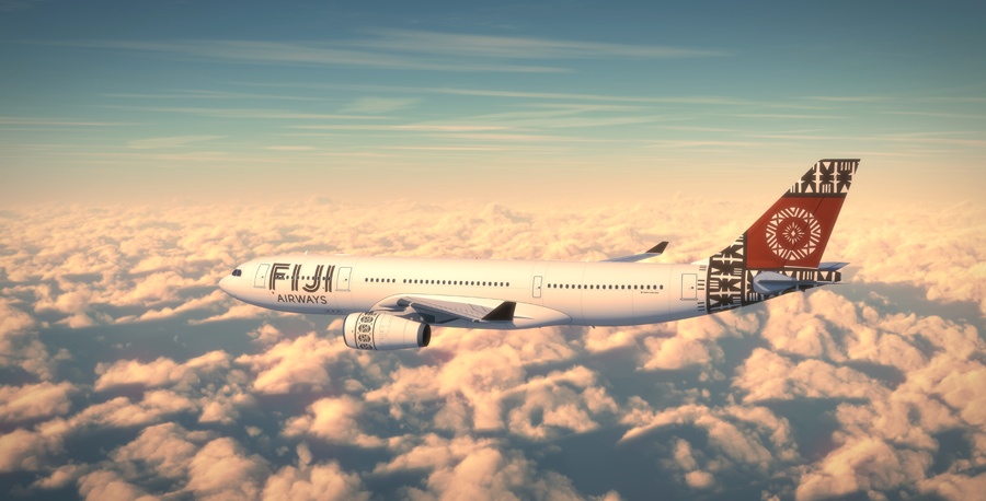
Airlines such as Virgin Atlantic, Fiji Airways, Air Calin or Bangkok Airways, which offer a full service but on smaller key routes often are the more preferential flying option compared to their competitors, these carriers can pick and choose profitable routes, and as such offer better seats, cabin services and prices compared to legacy carriers. They visually make themselves alluring, and exciting, utilising unique graphical elements, or interesting paint schemes to make themselves stand apart from their competitors.

Usually the carriers, pull on local design elements to help create an emotional attachment to their local fliers, whilst exciting other passengers at airports who may not know much about these smaller more nimble carriers. Typefaces are more considered, graphics tell a story and based on the smaller fleet numbers, paint jobs are more intricate and appealing to the eye. These are liveries that generally passengers will stop and take note of. Colours for boutique airlines are notoriously colours that are synonymous of the region they fly from (Apart from the globally recognised Virgin brand)
In conclusion
Carriers do generally follow a pattern of design depending on the airline concept, and the carrier can be best understood by looking at the livery they carry. From smart and sophisticated, to safe and reliable or luxurious to back-to-basics. Colours, designs, typefaces all help communicate hidden brand messages that help us build emotional attachment to carriers. Perhaps next time you are stuck in the airport, you will want to sit back, look at the apron, and try to work out what each carrier is trying to tell you without using words – this is the world of a livery designer. Designs stem far deeper than just pretty colours and simple shapes – thousands of hours of research go into making sure that we feel exactly what we should be when we look at one of these beautiful metal birds. That’s why airline branding truly is a multi-million dollar industry.
")